Since launching in 2019, CleanCo has become one of the most recognised names in the alcohol-free spirits category. Founded by Spencer Matthews, the brand built its reputation on a promise that was both simple and instantly appealing: “Skip the hangover, not the fun.” What began with one non-alcoholic gin soon grew into a full 0.0% range spanning gin, tequila, rum, vodka and whisky, bringing greater choice and greater personality to a fast-moving sector.
That growth, however, brought new demands. As the portfolio expanded, it became clear that CleanCo’s packaging had to do more: stand out more clearly, help shoppers navigate the growing range more easily, and work harder across retail, on-trade and digital environments. The ambition was not to lose the appeal that had made the brand so recognisable in the first place, but to build on it with a more confident, flexible and scalable visual identity.


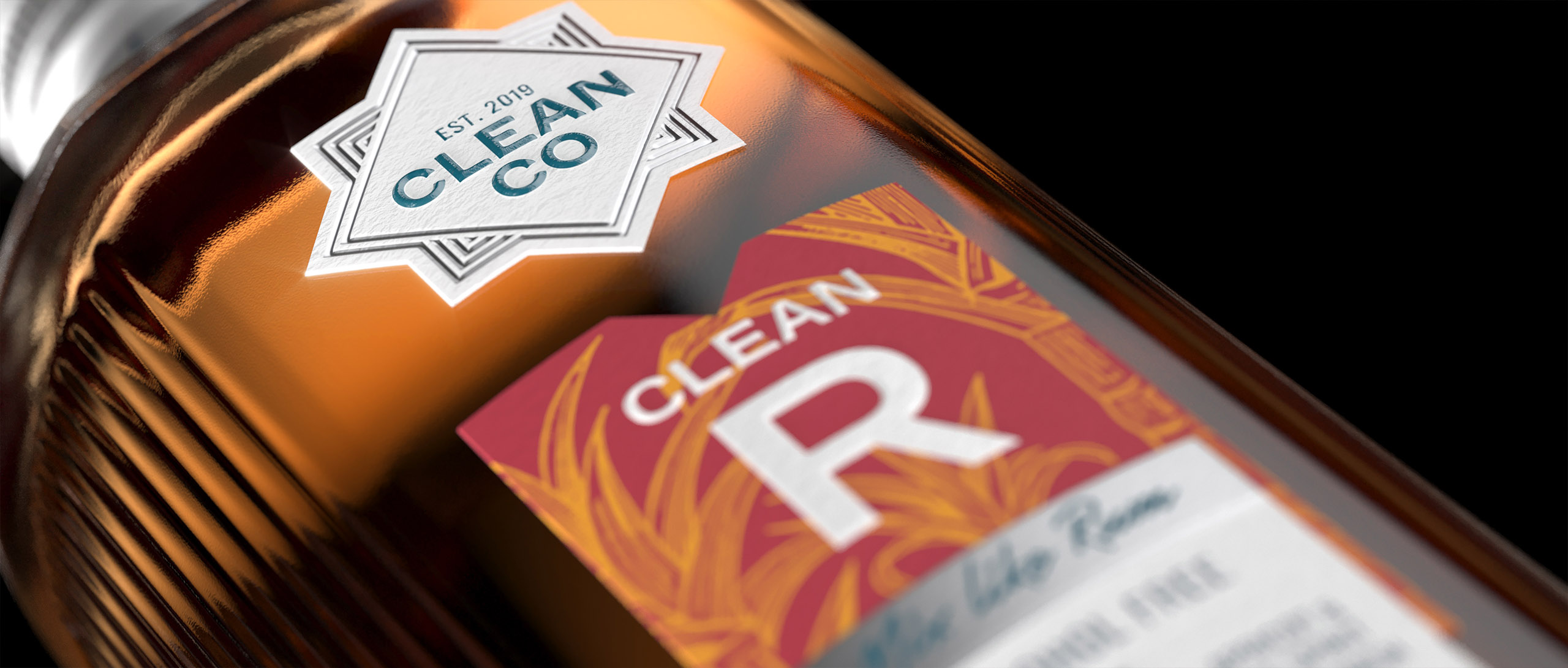
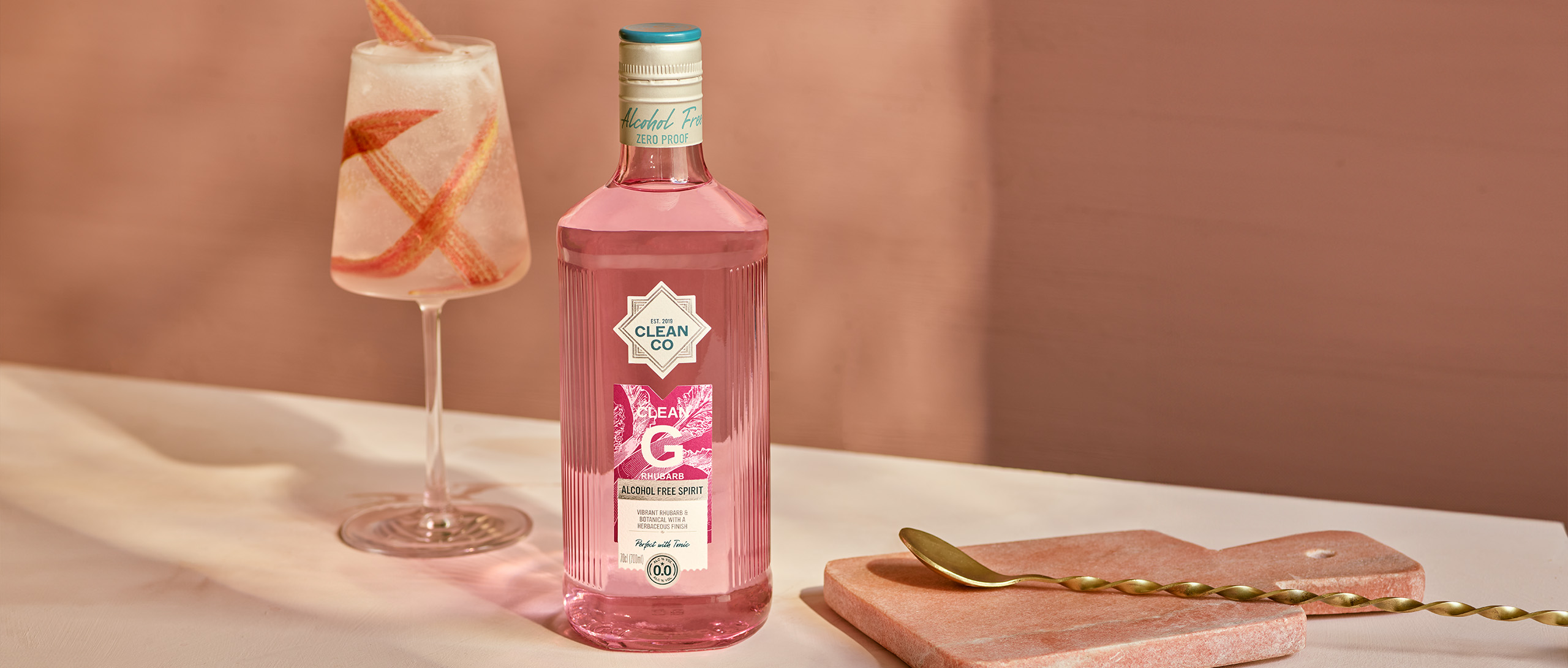
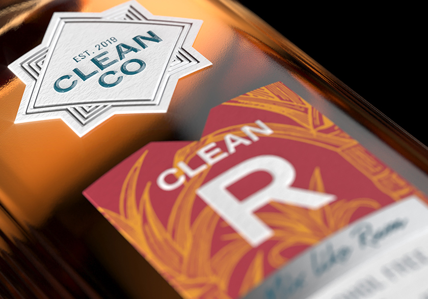
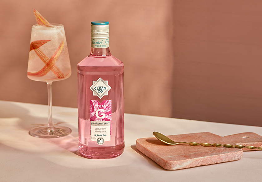
The creation of a new lightweight bottle was one of the catalysts to refreshing the packaging design. Developed in collaboration with Verallia Glass, the redesign retained the distinctive shape of the original pack while softening the bottle form to achieve the lightweighting. To compensate for the loss of surface area, the hexagonal structure was carefully refined. The front and back panels were widened to maximise label space and preserve the bottle’s strong on-shelf presence.
In the process, the new structure shed 65g of glass, with all mandatory copy relocated to a back label and a single ultralightweight mould introduced across the full range. The result was a more efficient pack that reduced material usage, improved production efficiency and lowered both freight costs and carbon impact, whilst preserving the structural equity of the original bottle.
The redesign also supported CleanCo’s broader sustainability goals. Each new bottle now requires half the energy to produce compared with the previous packaging, while the lighter format has reduced transportation demands, cutting more than 12,000 miles from the supply chain.
The new bottle structure also created the foundation for the next stage of the project: a refined visual identity and a clearer, more effective portfolio system designed to support CleanCo’s next phase of growth.


With the structural redesign complete, Knockout refined the visual identity, creating a clearer and more distinctive system for the growing CleanCo range. In an increasingly competitive category, the aim was not only to increase standout, but to make navigation across the portfolio more immediate and intuitive.
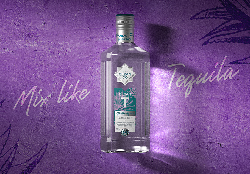
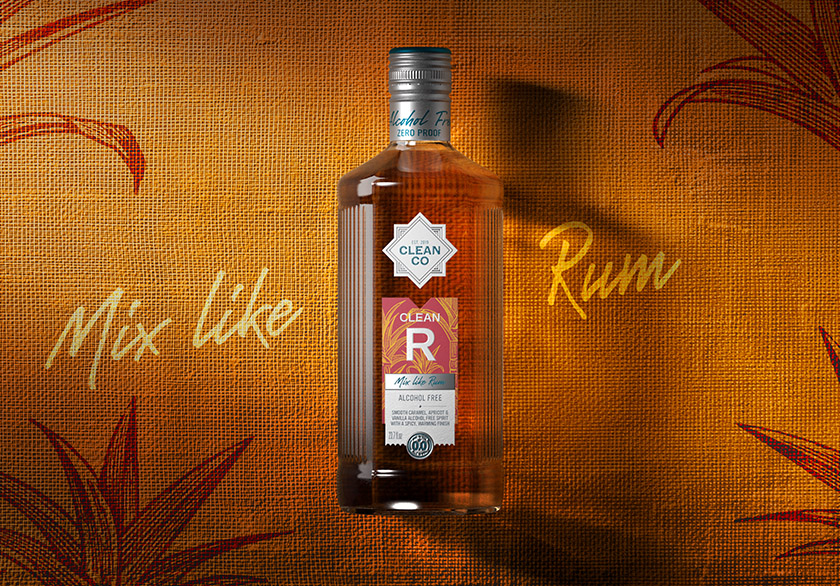
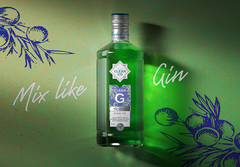
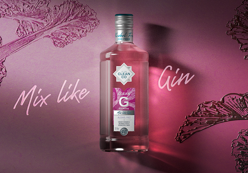
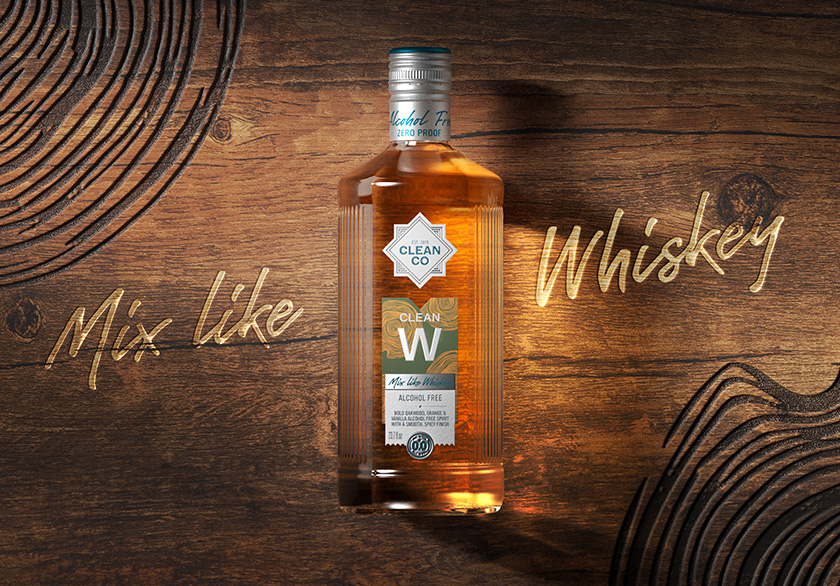
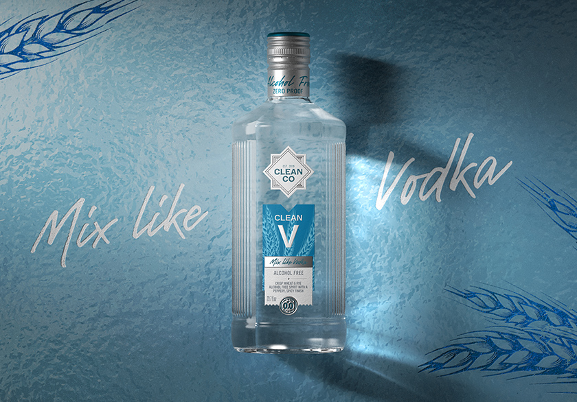
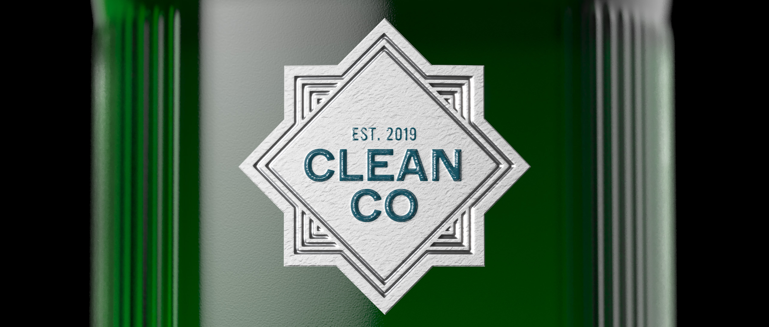
This refreshed identity was built around stronger, clearer communication and more intuitive navigation. The CleanCo wordmark was redrawn to appear larger, bolder and more legible, while the move to bright-white labels helped it remain crisp and visible across every setting, from supermarket shelves and cocktail bars to social content. A prominent “0.0%” icon also introduced to remove any ambiguity, making the alcohol-free proposition unmistakable from the very first glance.
To bring greater distinction to each SKU, Knockout developed a series of bold hand-drawn illustrations that express the character of each spirit category’s semiotics. Agave leaves denote tequila, oak barrels suggest whisky and juniper sprigs signal gin, giving every bottle its own visual shorthand without losing the strength of the wider family. Paired with a high-contrast colour palette, these elements give the range far greater standout while helping consumers find their preferred variant quickly and confidently. The result is a packaging identity that feels more vibrant, more modern and more versatile.
The true strength of the redesign lay in what happened next. Introduced in October 2024, the refreshed packaging set off a wider chain reaction across the business, delivering stronger shelf presence, clearer product communication, broader appeal and a more cohesive brand experience across the entire portfolio.
Commercial momentum followed. In the US, the Christmas season after the redesign overtook Dry January as the brand’s peak sales window, while in the UK, December sales at Tesco climbed and Clean T, the brand’s tequila alternative, saw particularly strong growth. Distribution broadened too, with a nationwide Waitrose rollout announced in May 2025 and on-trade accounts across the UK and Ireland rising sharply in the first quarter of 2025. Globally, an estimated 8.8 million “Clean Cocktails” were poured in 2024, roughly one every 2.8 seconds, a dramatic leap on the previous year and a powerful signal of the brand’s growing reach.
The redesign was also recognised with a Gold win at the DBA Design Effectiveness Awards, one of the industry’s most respected marks of success. What sets the DBA awards apart is their focus on effectiveness, rewarding design that delivers tangible results in market.
For Knockout, the Gold win carried particular significance, recognising a redesign that brought greater clarity, stronger standout and measurable commercial impact to the CleanCo range, while also reducing material usage and lowering its environmental impact.