BREEZER, Full Taste, Zero Compromise

BREEZER has always understood the energy of a good social moment: vibrant colours in the room, flavourful drinks in hand, and an effortless atmosphere that feels easy from the first sip. It stands for brightness, openness, and a distinctive flavour-first approach, all wrapped in a playful spirit that captures attention.

With BREEZER Hard Seltzer, the opportunity was to carry that same spirit into a new drinking experience. This category connects with a mindful, younger audience seeking lighter choices while still valuing sociability, expression, and taste.

For BREEZER, this was a natural extension. The brand already possessed many qualities that resonate with the moment: recognition, ease, and a sense of freedom. The challenge was to translate these attributes into a sparkling, Hard seltzer format that feels fresh and modern, while still unmistakably belonging to the BREEZER world.

No items found.
No items found.

Shaping the visual identity

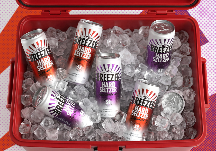
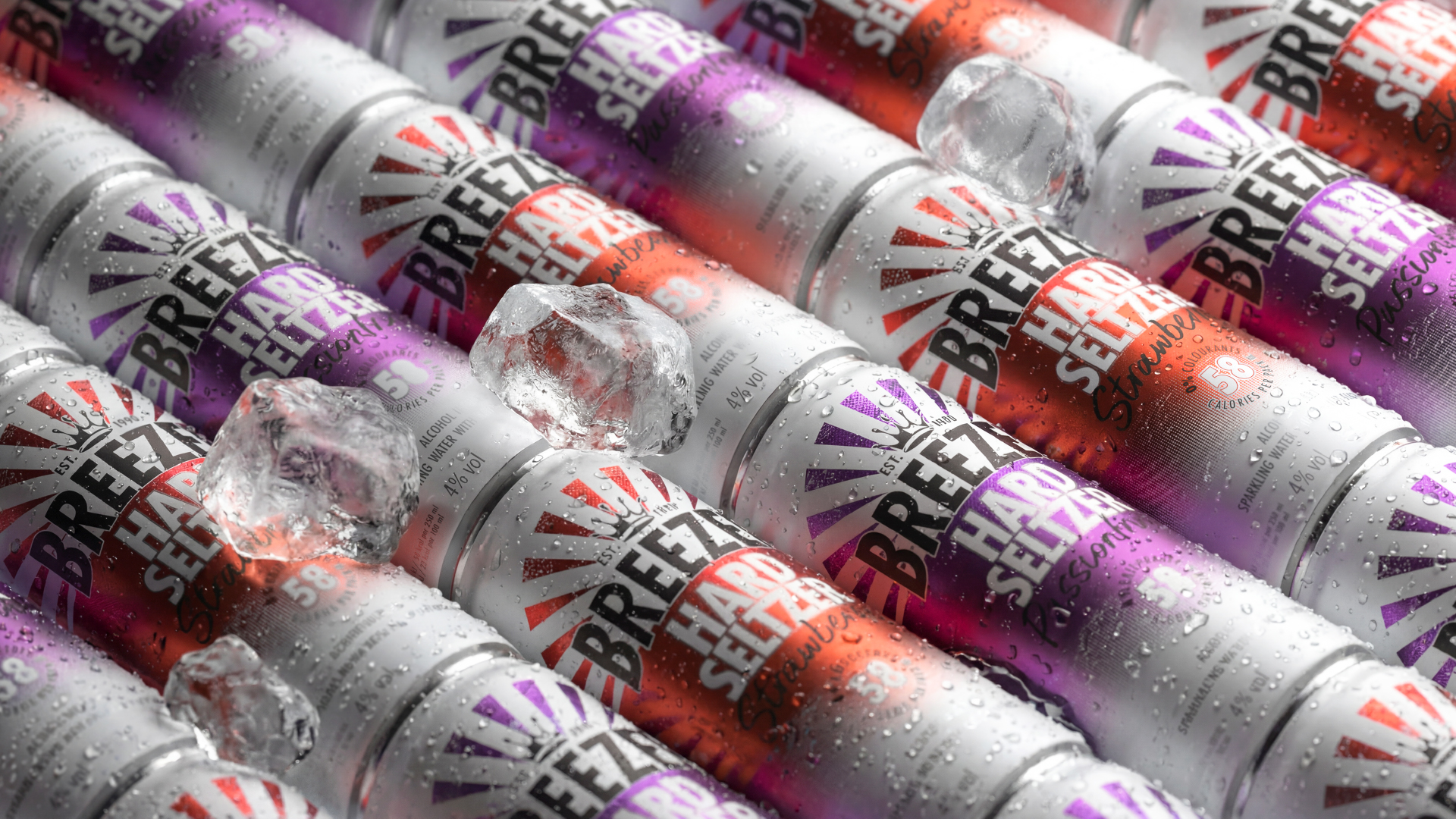
BREEZER Hard Seltzer takes the brand's flavour-forward DNA and presents it in a lighter, sharper format. Launching in Passionfruit and Strawberry, this new range encapsulates the vibrant essence of BREEZER in a sleek 250ml can design, featuring 4% ABV, 58 calories, natural flavours and no colourants.

The design aims to clearly communicate the Hard Seltzer concept while maintaining the recognisable character of the BREEZER brand. It needed to convey a sense of lightness without sacrificing presence, a clean look without appearing dull, and a contemporary feel while still reflecting the brand's natural warmth.

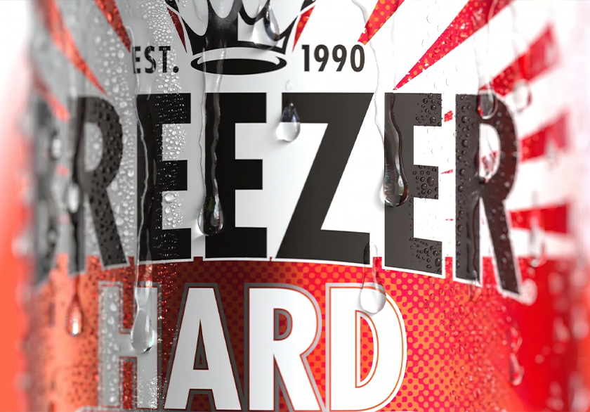
The design retains essential BREEZER elements such as the crown, bold brand mark, confident structure, flavour-driven colours, and a sense of movement. Surrounding these core features, the visual language expands. Ample white space introduces freshness and refreshment, while brighter colour cues enhance vibrancy and appetite appeal. Graphic rays create a sense of energy and pace, and the calorie count is prominently displayed within the overall hierarchy.

The result is a pack that communicates effectively: BREEZER prominently featured, Hard Seltzer clearly identified, and the 58-calorie count proudly highlighted.

No items found.
No items found.
No items found.

Taking the sparkle out into the world

With the pack established, the visual identity needed to be dynamic: flowing seamlessly from shelves to fridges, from social media feeds to menus, and from retail displays to on-trade moments. Every touchpoint had to convey a powerful message: a lighter, sparkling expression of BREEZER, with flavour at its heart.

The design system supports the pack’s freshness through clean white space, bright flavour cues, and lively graphics. This creates materials that feel cohesive without being repetitive. Across point-of-sale materials, digital platforms, social media, and on-trade environments, BREEZER Hard Seltzer presents itself with clarity and energy.

The outcome is a brand universe designed to complement the drink: refreshing in the fridge, lively in hand, and unmistakably BREEZER wherever it appears. BREEZER, Full Taste, Zero Compromise.

No items found.
No items found.
No items found.

Other Work

18

BREEZER, Full Taste, Zero Compromise

Packaging Design

17

A hidden reveal for your eyes only

Brand Personalisation

16

A tactile tribute to time

Packaging Design | Portfolio Extension

15

Turning the page on a new chapter

Brand World | Visual Identity | Brand Guidelines

14

The spirit of travel

Limited Edition Packaging | Activation Toolkits

13

A decade at the distillery

Brand Collaboration | Limited Edition Packaging | Press Kits

12

Where café meets craft

Packaging Design | Portfolio Extension

11

The gift that keeps on mixing

Packaging Design | Gift With Purchase

10

Prestigious harvests

Positioning | Bottle Design |Visual Identity

9

The OG RTD reclaims its crown

Brand Repositioning | Packaging Design | Visual Identity

8

Mix like you mean it

Visual Identity | Bottle Design

7

It's time to Play On!

Brand World | Brand Guidelines | Activation Toolkits

6

Soft - but with an edge

Brand Creation | Visual Identity | Packaging Design

5

A chameleon in crafted No/Lo

Brand Creation | Brand Positioning | Visual Identity | Bottle Design | Brand Guidelines

4

A cultural masterpiece

Brand Collaboration | Limited Edition Packaging | Press Kits

3

Cocktail companions

Packaging Design | Visual Identity | Secondary Packaging

2

Artistic interpretations

Brand Collaboration | Limited Edition Packaging Design

1

Flavourful infusions

Limited Edition Packaging Design

18

BREEZER, Full Taste, Zero Compromise

Packaging Design

17

A hidden reveal for your eyes only

Brand Personalisation

16

A tactile tribute to time

Packaging Design | Portfolio Extension

15

Turning the page on a new chapter

Brand World | Visual Identity | Brand Guidelines

14

The spirit of travel

Limited Edition Packaging | Activation Toolkits

13

A decade at the distillery

Brand Collaboration | Limited Edition Packaging | Press Kits

12

Where café meets craft

Packaging Design | Portfolio Extension

11

The gift that keeps on mixing

Packaging Design | Gift With Purchase

10

Prestigious harvests

Positioning | Bottle Design |Visual Identity

9

The OG RTD reclaims its crown

Brand Repositioning | Packaging Design | Visual Identity

8

Mix like you mean it

Visual Identity | Bottle Design

7

It's time to Play On!

Brand World | Brand Guidelines | Activation Toolkits

6

Soft - but with an edge

Brand Creation | Visual Identity | Packaging Design

5

A chameleon in crafted No/Lo

Brand Creation | Brand Positioning | Visual Identity | Bottle Design | Brand Guidelines

4

A cultural masterpiece

Brand Collaboration | Limited Edition Packaging | Press Kits

3

Cocktail companions

Packaging Design | Visual Identity | Secondary Packaging

2

Artistic interpretations

Brand Collaboration | Limited Edition Packaging Design

1

Flavourful infusions

Limited Edition Packaging Design